Up Your 2023 Bullet Journal Game with these Brush Lettering Tips & Tricks

We asked what you’d like to see on the blog this year and “brush lettering” was by far the most popular response. Now, full disclosure: I’d actually pencilled in a brush lettering blog post all the way back in 2021 when I first started blogging for Nikki’s Supply Store, but it kept getting pushed back. I was self-conscious about my lettering and didn’t want to share it, let alone give advice! But as Nikki said in her latest YouTube video:
“We’re not aiming for perfection, we’re just aiming to enjoy ourselves!”
We’re all about embracing imperfections and works-in-progress over here, so let’s dive in…

This Brush Pen Starter Set is a great way to try a few different pens out!
What supplies do I need for brush lettering?
Smooth paper: You can use a journal or loose sheets of paper, but smooth paper is preferable as rougher textures (e.g. kraft or recycled paper) can fray delicate brush pen nibs. It’s up to you whether you use plain, lined, dot grid or squared paper for brush lettering. I personally like to use an Archer & Olive dot grid journal as the paper has a lovely smooth surface and the dots are helpful for keeping letters consistently sized and spaced, or trying to! I usually use the pages at the back of my bullet journal, or the separate journal I use for planning spreads and creating blog post content. If you only have plain paper, you may find it helpful to draw guidelines with a ruler and pencil.
Pencil and rubber: You may want to sketch your letters out first or maybe you just wanna dive in and see where your nib takes you. All approaches are welcome here! It’s worth noting that pencil lines may be visible through some of the more translucent brush pens e.g. Zebra Mildliners.
Perhaps most importantly: A brush pen or two! There’s a world of difference between the different brands so it’s a good idea to try a few. It’s helpful to have at least a couple of different nib sizes in your stash for creating small and large letters. We’ll cover the differences in more detail later.
Practice sheets can be a great way to practice forming letters and words if you’re completely new to the world of lettering. There’s lots of free printables available online such as these ones from Stabilo and Pentel or you can find bumper packs on Etsy containing letters in different styles and sizes.

From Stabilo's Hand and Brush Lettering Guide
Brush Lettering Technique
The main feature of brush lettering is the distinctive “thick and thin” lines, which are formed by varying the pressure on upwards and downwards strokes. You want to use medium to medium-firm pressure for downward strokes to create thick lines, and light pressure for upwards strokes to create thin lines. Don’t be scared to apply pressure to the nibs as they’re designed to be flexible! You’ll need to use more pressure with smaller, firmer nibs, such as the Pentel Fude Touch Calligraphy Pens, but you’ll start to get a feel for it after a while.

Don’t let all this talk of applying pressure lull you into believing you need a death grip on your brush pen! Far from it: Aim for a comfortable, relaxed hold, with your pen at a 45 degree angle to the page. This is the optimum angle to switch between firm pressure for downward strokes and light pressure for upward strokes. If your wrist ends up at an uncomfortable angle while forming a letter or word, try moving or rotating your paper, rather than your wrist or body.

Videos on Instagram and TikTok are often sped up so don’t be afraid to take your time! You can also take your pen off the page as often as you need to. This isn’t cursive and there’s no need to do everything in one fluid motion.
Prior Preparation Prevents Poor Performance
We don’t like to takes ourselves or our craft too seriously here, but here’s a few tips to make your brush lettering practice go more smoothly:
- Make sure you’re comfortable. Do you need the toilet? Are you hungry? Sounds ridiculous but being uncomfortable can really affect your lettering!
- This might sound at odds with the last tip but sitting on an upright chair at a desk or table puts you in the optimum position for lettering. Save the sofa for later, at least until you’re a bit more confident
- Try a few simple warm-up exercises each time you sit down to practice brush lettering, such as up and down brushstrokes, squiggly lines and circles

Which brush pens are best for beginners?
That’s a question without a straightforward answer! They vary enormously, and each type has different strengths and challenges. What works for me may not work for you and vice versa, so I’ll give a brief overview of the varieties that Nikki’s Supply Store stocks:
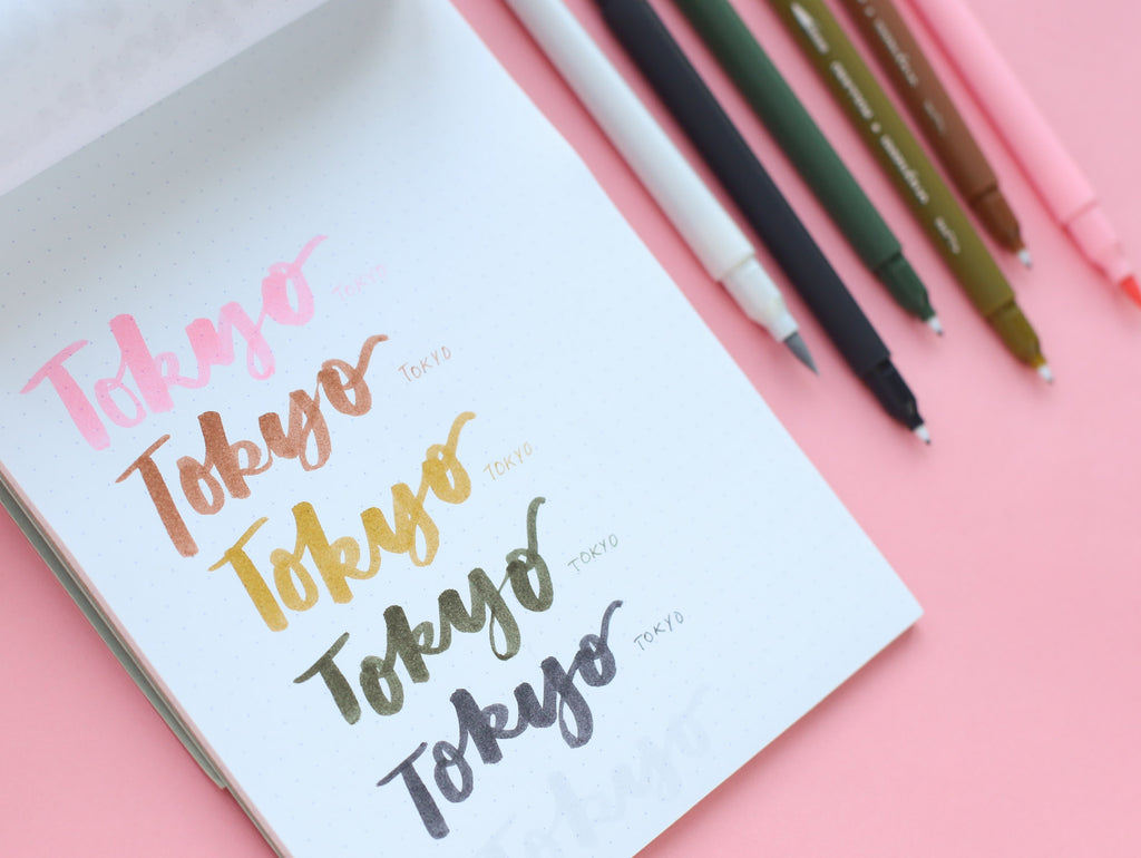
Bruynzeel Fineliner / Brush Pen Dual Tip
These are a great budget-friendly option, and having a matching fineliner on the end is so handy for creating co-ordinated spreads in your bullet journal. The nibs are long and flexible but reasonably thick which makes them easier to control than say, a Tombow or Sakura brush pen. The nibs feel slightly drier and less “juicy” than some of the other options.


Pentel Fude Touch Brush Calligraphy Pen
I was today years old when I learned that ”fude” is short for “fudenosuke” which translates as “brush that helps”. I love that! The plastic tips are short and firm, so these are fantastic for creating smaller headings, such as the days of the week in a weekly bullet journal spread. You need to apply more pressure to vary the thickness of upward and downward strokes due to the shorter nib, so you may find it easier to learn the basics with a longer, softer brush first.
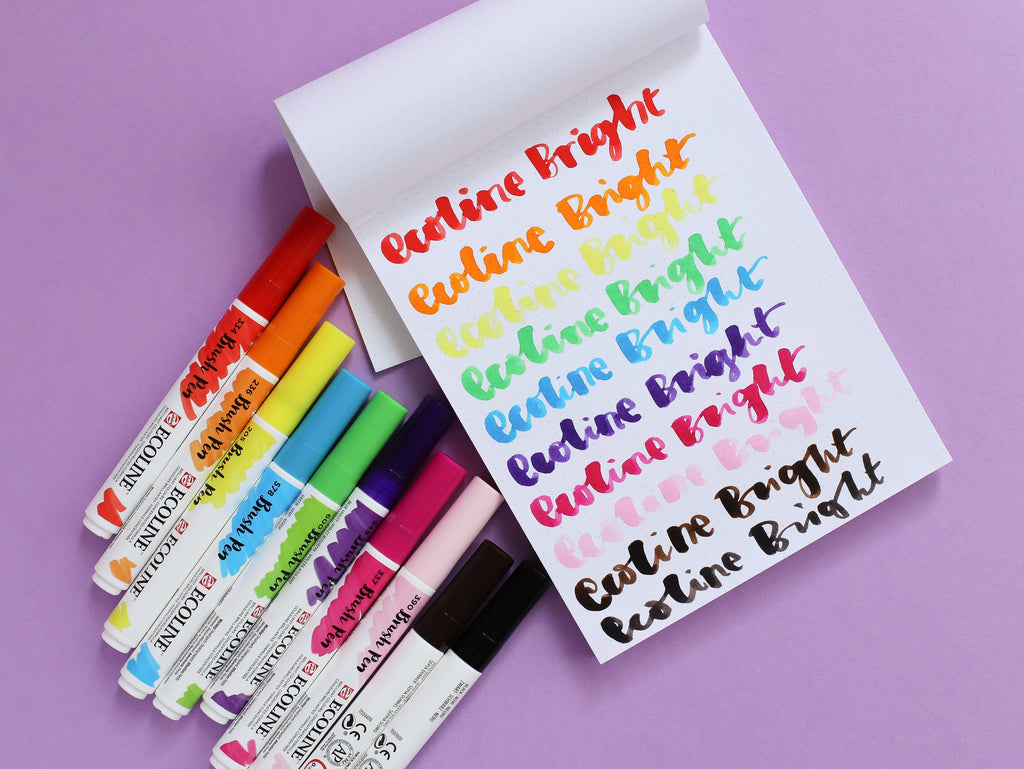
Royal Talens Ecoline Brush Pen
These are incredibly vibrant, juicy and so lovely to write with! As with the Bruynzeel brush pens, their tips are long and flexible, but reasonably thick which makes them easier to control than the Tombow or Sakura brush pens in my humble opinion. They produce the thickest lines of all the brush pens at Nikki’s Supply Store and are definitely one of favourites!

These have very long, thin and flexible nibs which take a bit of getting used to! They’re harder to control than other soft-tipped brush pens, although they do give a lovely paintbrush effect.

This set contains three different sized nibs. The fine brush is similar to the Pentel Fude Touch, and perfect for smaller lettering. The medium brush predictably sits between the Fude Touch and most other brush pens. The shorter nib makes it easier to control, while still giving clear definition between up and down strokes. The bold brush has the longest tip of all the brush pens available and creates a satisfyingly thick line!

These have slightly shorter brush tips with medium flexibility, which makes them easier to control while still giving good up/down thick/thin definition. I’m a big fan of the Stabilo 68 pens in general, and these are no exception! These were my go-to when I first started practising brush lettering.

Tombow Classic Black Brush Pen
These seem to be a firm favourite in the bullet journal community although I must confess, I find them harder to control than other similar brush pens such as the Zebra Mildliner, and they don’t seem to produce as good a finish in my hands! I’m not sure if it’s the longer barrel length? With that said, they produce a lovely bold thick line.
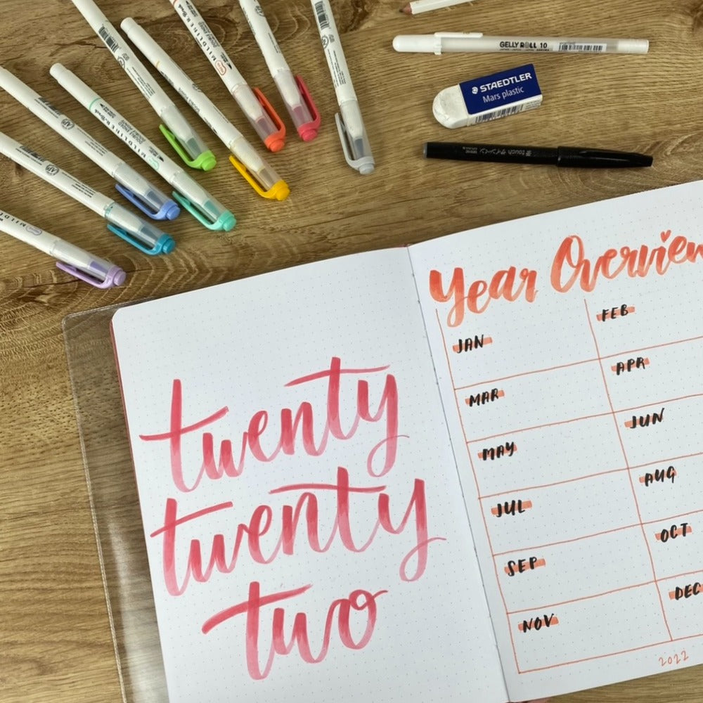

These are another favourite of mine. They have a medium-length soft tip, but don’t feel as unwieldy as some of the other soft brush options! The muted pastel colours are fantastic for blending or creating ombré effects and again, and it's always handy to have a matching fineliner on the end.
Brush Pen Comparison
I spoke a little bit about how some of those brush pens compare to others, but I thought it may be useful to see them all swatched together:

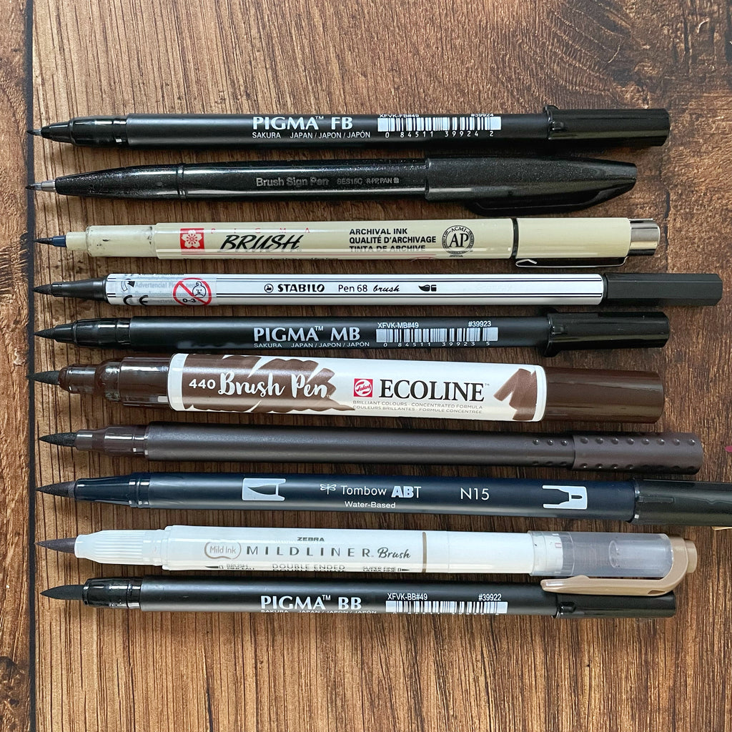
While you'll generally find longer nibs produce thicker lines, is not quite as simple as that, as that doesn't take into account the thickness or softness of the nib! Here's all 10 nibs rated from shortest to to longest:
Find Your Style
Once you’ve mastered the basics, it can be a lot of fun to play around with brush lettering and find your own unique style! Here’s a few ways to mix it up:
- Experiment with upright vs italic letters
- Add swirls and loops
- Vary the base of each letter - you don’t need to keep everything at the same level!
- Create an ombré effect by blending your brush pens - see Nikki’s YouTube video below for details
Want to see the brush lettering technique in action? We got you! Nikki has shared how she uses some of the brush pens from this blog post, as well as a super cool ombré effect with Zebra Mildiners:
Fake it ‘til you make it!
Sometimes there’s words and letters you just can’t get to play ball, and sometimes you just wanna take a shortcut! I confess I did very little brush lettering practice in 2022, but still wanted to use it on some of my bullet journal cover pages. Rather than risk ruining a page I was otherwise happy with, I printed and traced this, and filled it in with fineliners. Simple, yet effective!

Brush Lettering Key Takeaways
- Take it sloooooow and don’t be afraid to take your pen off the paper
- One more time: Firm downward strokes, light upward strokes
- Practice practice practice!
I hope that’s given you a little inspiration to get started! Why not bookmark this page in case you need to refer back to it? If you’ve been inspired by any of the suggestions in this post, we’d love to see! Please tag @nikkissupplystore and #NikkisSupplyStore on Instagram, where you can find heaps more journaling and stationery inspiration. You can also follow me, @joy.margot, for more craft content and pictures of my cat, Juniper.
